Park.it
A UX Case Study
The Waze of parking spots. Park.it is a navigational app with real-time street parking built in, making the drive to park process seamless and reliable.
The Problem
LA drivers need to find street parking fast because too much time is spent searching & deciphering confusing street signage in high traffic areas.
The Research
In order to validate if this problem exists, a series of interviews were conducted as well as an analysis of the current competition.
user interviews
Participants included both men & women, ages 28-39, who drive a car in LA
A few of the participant’s comments when asked questions related to parking in LA.
Based on answers related to their driving & parking habits, participants were split into two distinct groups of drivers.
Driver 1
users who only drive from one place to another (i.e. home to work), once a day
parking needs are typically evenings or weekends
utilize other forms of transportation (i.e. Lyft, Uber) as alternatives
Driver 2
users who drive multiple times throughout the day due to work needs
parking needs are weekdays
parking needs are short-term near high traffic business areas
parking needs are in various locations
competitive analysis
Top 3 navigational apps Google Maps (left), Apple Maps (middle), and Waze (right) and their respective parking features. These features are limited to public garages and lots only.
ParkMe is a dedicated parking app with real-time street availability. The user is prompted to open Google Maps to get directions.
Insights & Discovery
Although participants were categorized into different groups of drivers, they shared some interesting commonalities when it came to parking. Both groups . . .
use navigational apps for directions only
determine where to park during their drive
rely on visual way finding as their primary source for finding a parking spot
agree that parking signs are confusing/contradictory and just want to know “Can I park there or not?”
There also appears to be a gap in the market when it comes to navigation and street parking hybrid apps. They either don’t exist or don’t have a user friendly interface.
Google Maps, Apple Maps, & Waze are great for directions but lack a real-time street parking feature. And while parking apps like ParkMe have the technology, the app suggests the user make their parking decision before their drive and then be re-directed to another app for directions.
Without the combination of both functionalities, the user isn’t getting a seamless experience and therefore, their needs aren’t being met.
The opportunity then becomes . . .
User Personas
Focus is narrowed on Driver 2 group since they drive more frequently and could benefit the most from having a real-time parking feature. Personas were created based on Driver 2 interview responses.
redefining the problem and next steps
LA drivers need to get real-time parking data during their navigation.
“How to communicate, through design, the value of this product to the target audience?”
The goal is to keep the design simple & easy to use while focusing on the real-time street parking feature as the app’s Minimum Viable Product and convert new users into loyal users.
The Ideation
With the target user identified, preliminary sketches and a framework for the app were created. Usability testing and feedback offer new insight and design pivots.
card sorting
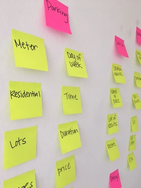
An open card sort was kept simple using familiar language that users would recognize from other apps. Users were asked to sort these cards into categories provided.
Site map
The mobile app’s site map consists of 2 basic categories. Features are kept minimal in an effort to focus on MVP.
user flow
The user flow is similar to other navigational apps for consistency so the user doesn’t have to “learn” new steps. The happy path comes near the end of the drive when parking icons display within a fixed radius of the destination to alert user of open spots, which they can select and re-route directions to.
Sketches & usability testing
a progression of key screen iterations
Feedback - users were confused by why there were multiple parking symbols on the screen and which one they should be referencing
Pivot - communicate parking directly on map for better visibility
Feedback - some users liked the concept of colored green lines to indicate availability but the red and orange lines felt too busy and not relevant since they’d only be looking for parking spots available now; one user mentioned that the colored street lines resembled traffic when compared to other apps
Pivot - eliminate colored street lines to avoid confusion
Feedback - users responded well to parking symbols displayed on map and understood the differences after tapping each one individually to get more details (price, duration, proximity to destination)
Pivot - a larger parking icon (not shown) was later added to indicate that it’s the best spot in relation to user’s destination
yes, but what if . . .
. . . the selected parking spot gets taken before the user gets there?
Solution: the app will re-load with directions to next best open spot (similar to how Waze updates the route if user misses a turn)
. . . the user sees an open spot that is not listed as ‘available’ on the map?
Solution: the app’s algorithm pulls in data from parking meters with sensors based on given time and day (residential street parking data is omitted for now since target user’s parking needs center around high traffic business areas)
Initial user testing was done indoors but moved to a car in order to simulate a more realistic environment.
The Prototype
User testing feedback and various iterations of key screens resulted in the final design.
wireframes
onboarding
In-app tutorials are showcased during the onboarding screens to ease users in and highlight the value of the product,


